3.6 Disabled checkbox text difficult to read due to low contrast (Observation)
3.6.1 Disabled checkbox text difficult to read due to low contrast
On the Monitoring Details page, certain checkboxes are disabled and rendered in grey text on a white background, resulting in a contrast ratio of approximately 2.3:1. While contrast requirements do not apply to disabled or inactive elements, the low contrast still makes the text hard to read for many users, including those with low vision or contrast sensitivity, which can lead to frustration or misunderstanding.
Additionally, the input uses the native disabled attribute, which removes it from the focus order and prevents screen reader users from being informed of the disabled state or reason. As highlighted in [Buttons are coded as links and dynamic updates are not announced by screen readers (High)]9, using aria-disabled="true" instead of disabled would allow the element to remain focusable, enabling all users to perceive and understand why the option is unavailable.
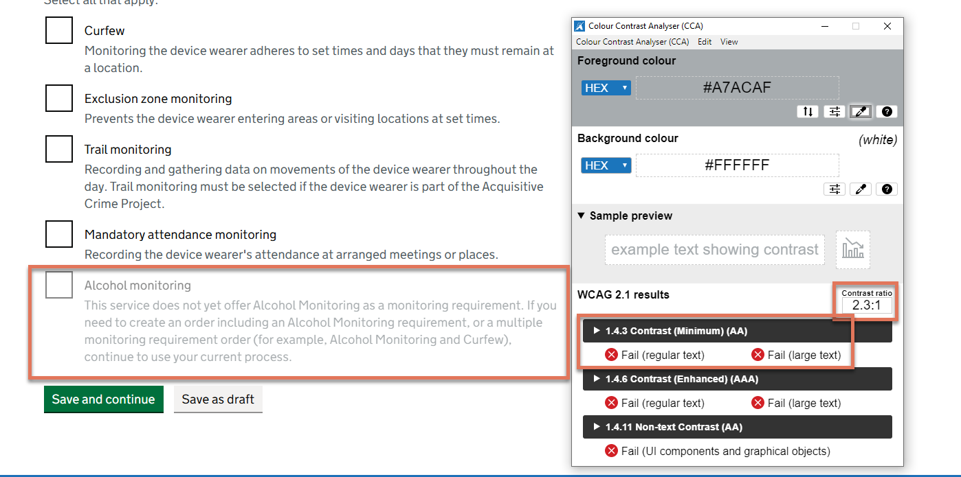
FIGURE 3.6: Greyed out text on Monitoring Details page
3.6.2 Recommendation
Increase the text colour contrast of disabled elements against the background to at least 4.5:1, and include an additional indicator to clearly show that the element is disabled, for example, adding “(not available)” to the label text. This ensures all users, including those with low vision or cognitive impairments, can easily perceive that the option is unavailable and understand why.
Also replace the native disabled attribute with aria-disabled="true" and style the disabled state with CSS. This will keep the checkbox focusable so screen reader users can perceive both the control and its disabled state.