1.2 Positive: Select components are technically accessible (Positive)
1.2.1 WCAG 1.3.1 (A), 4.1.2 (A) - Desktop
Although GDS research advises that select components should only be used as a last resort in public-facing services, as some users find them difficult to use, the select elements implemented here work well from a technical perspective. When tested with screen readers such as NVDA and JAWS, options are announced correctly, and users can navigate through the list without issues. The comboboxes are also easily navigable with the keyboard’s directional arrows, and users can type the first letter of an option to jump directly to that section of the dropdown for quicker navigation.
For scenarios where there are many options, such as language selectors, a select component is appropriate since converting these into radio buttons would be impractical and overwhelming for users.
However, for shorter lists like “What type of offence did the device wearer commit?” or “Order information”, another option could presenting these questions on a separate page using radio buttons instead. This aligns with the GDS approach in other services, providing simpler navigation and clearer choices for users who may struggle with select menus.
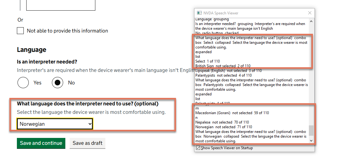
FIGURE 1.2: Combobox with NVDA speech viewer activated