1.1 Positive: Secondary checkbox input announced effectively (Positive)
1.1.1 WCAG 1.3.1 (A), 4.1.2 (A) - Desktop
On forms throughout the service, checkboxes are sometimes used to conditionally reveal an additional input field. The checkbox includes aria-controls and aria-expanded, and when tested with a screen reader, it is announced as “checkbox not expanded” or “checkbox expanded”, depending on its state. This ensures that screen reader users are aware that interacting with the checkbox will reveal or hide more content, providing clear feedback about the form’s dynamic behaviour.
This approach works well for checkboxes, making the experience more inclusive for users who rely on assistive technologies.
It is worth noting for future implementations that aria-expanded does not behave reliably with radio buttons, and expanded/collapsed states are not always announced in that context, as noted in Conditionally revealed radio inputs could be made clearer (Low).
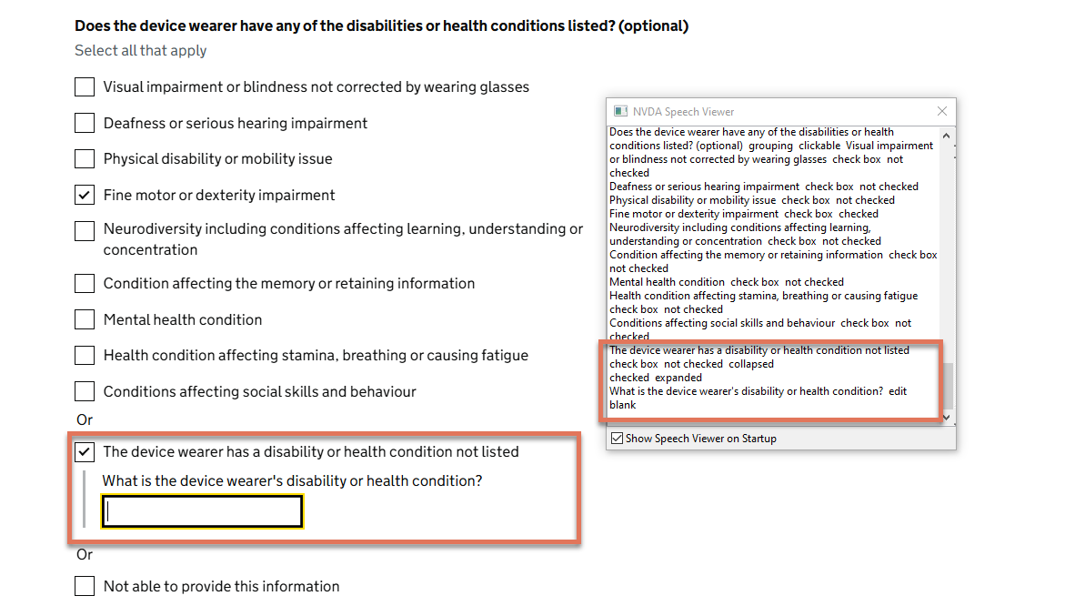
FIGURE 1.1: Secondary input in disability checklist
1.1.2 Code Snippet
<input id="disabilities-11" name="disabilities" type="checkbox"
      aria-controls="conditional-disabilities-11" aria-expanded="true">

<div id="conditional-disabilities-11">
  <label for="otherDisability">
    What is the device wearer's disability or health condition?
  </label>
  <input id="otherDisability" name="otherDisability" type="text">
</div>